 Successfully Creating and Presenting Graphics Successfully Creating and Presenting Graphics
Mihalis Tsoukalos
Successfully creating and presenting graphics is an art, a difficult one. Most of you have likely seen (or perhaps created) graphics that were too complex, too simple, too big, too small, too colorful, etc. This article discusses how to successfully present graphics to your technical colleagues and your boss. It also presents various types of graphics and explains their correct usage and functionality. One article cannot cover every possible aspect of graphics creation and presentation, however, so if you want to research this interesting subject more deeply, you'll find more information in the "References" section at the end of the article.
Does This Matter?
Most people create a graphical image because they want to convey a message, discover an unusual pattern, or express an idea. If your graphical image is not appropriate, the audience may not get the message, you may not discover the pattern (i.e., a possible security attack), or the idea may not be expressed appropriately. What is the point of creating something that does not meet its purpose? Or, even worse, what is the point of creating a graph that delivers the opposite of what you initially wanted? So, successful graphics do matter.
The Sample Data
To better express the ideas of this article, I will use some sample data. Table 1 shows part of the data taken from the log files of a busy Web server. Please note that I created the data for the browser column myself. To better understand why the output of the presented images is highly populated, I should also say that the data file I used contains about 1,040,000 rows!
Data was imported in the R package using the following commands:
> data <- read.table("WWWdata", header=TRUE)
> attach(data)
> dataMatrix <- as.matrix(read.table("WWWdata", header=TRUE))
The first command creates a data set, called data; whereas the third command creates a matrix, called dataMatrix. Matrices are useful because they allow the creation of 3D graphics in R. Actually, most of the R commands that create 3D graphics require matrices as their input. The attach() command is used so that objects in the data set can be accessed by simply giving their names.
This article will not use the dataMatrix data set, but it is helpful to know how to create a matrix in R. Although 3D graphics are very impressive, the main reason for not creating them here is that not all data sets are suitable for 3D graphics generation, and we do not want to present something that is not understandable.
Using R to Create Graphics
A big part of this article uses the ggplot R package to create graphics. The ggplot package implements -- in an R package manner -- the ideas found in the book called The Grammar of Graphics by Leland Wilkinson. ggplot is very handy for creating graphics, although you have to spend some time to learn how to use it.
As the ggplot package is not included in the standard R packages, you must install it yourself. After installing the ggplot package, you can load it using the following R command:
 > library(ggplot)
Loading required package: grid
Loading required package: reshape
Loading required package: RColorBrewer
 >
After loading the packages, you are ready to use ggplot. If you are totally unfamiliar with ggplot, you can get some help by typing the following R command:
> help(ggplot)
Creating a Graph of Time vs. TimeTaken
For this example, I will create three versions of the same graph using the ggplot library. The only difference between the versions is the size of the dot used to draw a point. Notice how much difference the dot size makes to the final output. I used the following commands:
 > w <- ggplot(data)
 > w$title <- "Time vs TimeTaken graph"
 > ggpoint(w, aesthetics=list(y=TimeTaken, x=Time), colour="green",
size=0.5)
 > ggpoint(w, aesthetics=list(y=TimeTaken, x=Time), colour="green",
size=2)
 > ggpoint(w, aesthetics=list(y=TimeTaken, x=Time), colour="green",
size=4)
The first two commands are common to all three graphs. Note the presence of a main title as it is very useful for understanding the data. Figure 1 shows those three variations. I prefer the first one (size=0.5), but the second one (size=2) can be also useful. The third one (size=4), I think, it is not as useful because each individual dot is too big for such a graph. All three images show clearly that there are not any major delays when serving Web requests. The green color makes the graph more pleasant.
The output of Figure 1 is not so complicated and can be utilized even on a non-technical presentation. On the other hand, the output of the pairs() command, presented in Figure 2, is technically oriented. It is not meant to be shown to your manager, for example, unless she is a technically oriented person. You should use it to get an overview of what is happening and show it to your (technical) colleagues only. Such graphs are also suitable for technical conferences like LISA, USENIX, etc.
Also note that complicated graphics are perfect for decorating your office, because they will make people think that you are very busy -- as indeed most systems administrators are.
Creating histograms
Provided that you did not overload its output, a histogram can be seen by non-technical people. Please do not forget to add a title using a relatively big font -- bigger than the other fonts used in the rest of the histogram, at least.
Figure 3 shows a poorly created histogram, whereas Figure 4 shows a more effective histogram of the TimeTaken column data. Note that the square root function was used (twice!) for creating Figure 4 because otherwise the output would have been too unbalanced and thus unreadable.
Figure 3 was created using the following R command:
> hist(TimeTaken)
Figure 4 was created using the following R command:
 > hist(sqrt(sqrt(TimeTaken)), breaks=40, \
  xlim=c(0,15), ylim=c
(0,60000), labels=TRUE, col="lightgrey")
This command may look more complicated, but its output is more elegant.
Notice how much the ylim=c(0,60000) parameter helps make the histogram more readable. Also notice the use of the light gray color instead of a bright color. Also be aware that you do not have to load the ggplot package in order to use the hist() command.
Learning More
There are times that you need to learn more about certain types of your data. Software like R can help you visualize data in categories. The following commands will plot Figure 5. It is easy to understand the usefulness of this figure.
 > w <- ggplot(data, . ~ Browser, \
   aesthetics=list(x=TimeTaken, y=Time))
 > print(ggpoint(w))
Although Figure 5 looks fine, we can make it even better! We can make the size of each dot a little smaller by using the following command:
> print(ggpoint(w, size=0.5))
By using a different R package, called lattice, we can present the same output in a slightly different form.
If you execute the following commands, you will get Figure 6:
 > library(lattice)
 > xyplot(Time ~ TimeTaken | Browser)
Although Figure 6 does not present the numbers in the Time axis very well, it is considerably better formatted and presented than Figure 5. The key point here is to experiment. I will say it again; experiment as much as possible until you are satisfied with the output.
Advice
R is able to create maps of the world with the help of the map R package. Adding a map to your presentation can be impressive and is therefore highly recommended. In this section, I will show you such an example. The following commands will create Figure 7:
 > library(maps)
 > myMap <- as.data.frame(map("world", \
  xlim = -c(113.8, 56.2), ylim =
c(-21.2, 36.2), plot = FALSE)[c("x", "y")])
 > qplot(x, y, data = myMap, type = "path")
Although maps can be used on their own, the following subsection will present an alternative use of such maps.
Adding More Information
Most of the time, adding more information to a graph is not a good idea. Nevertheless, there are times when additional data add to the general look of the graph, making it more interesting. So, I will show you a way to add an external graphic file in your existing graphics. I will use Adobe Photoshop, but you are free to use whatever you want. Do not be afraid to add relevant images to your output.
First, I created a graph with the Time column using the following commands:
 > plot(Time, col="lightgray")
 > box()
After saving the output, I imported it into Photoshop and added the image I wanted. The possible results of the aforementioned procedure can be seen in both Figures 8a and 8b.
Notice how much more professional and impressive the output looks as it also depicts the scope of the presented graphics. Note that although R can embed images to graphs, I find it very difficult so I usually do that using Adobe Photoshop or other similar software.
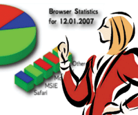
Figure 9 presents two simple pie charts. Which one do you prefer? This shows that even simple or simplistic graphics can be made more professional and attractive if you try.
Improving the Graphics
This section suggests other things that can be done to improve some of the presented graphics.
- Figure 1: You could add some more information about the machine name and the date of the captured logs.
- Figure 2: You could add text about the Web server type (Solaris, Mac OS, Windows, etc.), its Internet connection, and its configuration.
- Figure 3: You cannot improve it. Just make sure that you will not produce similar histograms!
- Figure 6: You could improve its look by making the Time axis values less populated.
- Figures 8a and 8b: You could add information about the date and the number of entries in the log files. You could also make the fonts bigger.
Some General Rules
Here are some general rules to keep in mind when creating graphics:
- Complicated graphics are of little use.
- Always use legends and titles in graphics.
- Keep it simple!
- Know your audience.
- Know your target.
- Experiment as much as possible!
- Trust your own eyes. If you don't like what you created, chances are that other people will not like it.
- Do not use many colors.
- Keep your graph clear and accurate.
The main reason that I used R for this article is the fact that R can handle huge amounts of data without problems. I am not so sure whether Microsoft Excel could have processed 1,000,000 records of data. If you have less data, then Microsoft Excel is a nice alternative, especially if you are not used to using R.
I recommend learning an advanced statistics package as it will help you be more creative. The main benefit for a systems administrator is that it will make your output really unique and creatively different from all those Excel charts. More people will look at your graphics (because of their uniqueness), and your boss will be happy to have such an employee.
Conclusions
I've shown many techniques in this article, but keep in mind that this is just the beginning. Apart from R, you can also use Microsoft Excel, gnuplot, Matlab, Mathematica, or Perl to create graphics. Remember that the key point to creating successful graphics is to experiment. Try many variations until you find the one that is suitable for your data.
References
The ggplot R package -- http://had.co.nz/ggplot/
R Project home page -- http://www.r-project.org/
R-help mailing list -- https://stat.ethz.ch/mailman/listinfo/r-help
Maindonald, J. and J. Braun. 2007. Data Analysis and Graphics Using R: An Example-based Approach, 2nd Ed. Cambridge University Press.
Murrel, Paul. 2006. R Graphics, Chapman & Hall/CRC.
Robbins, Naomi B. 2004. Creating More Effective Graphs. Wiley-Interscience.
Tsoukalos, Mihalis. 2005. "Using the R System for Systems Administration", Sys Admin:14(1).
Tufte, Edward R. 2001. The Visual Display of Quantitative Information, 2nd Ed. Graphics Press.
Venables, W.N. and B.D. Ripley. 2002. Modern Applied Statistics with S, 4th Ed. Springer.
Venables, W.N. and B.D. Ripley. 2004. S Programming. Springer.
Venables, W. N. and D.M. Smith. 2002. An Introduction to R. Network Theory, Ltd.
Wilkinson, Leland. 2005. The Grammar of Graphics, 2nd Ed. Springer.
Mihalis Tsoukalos lives in Greece with his wife, Eugenia, and works as a high school teacher. He holds a B.Sc. in Mathematics and a M.Sc. in IT from University College London. Before teaching, he worked as a Unix systems administrator and an Oracle DBA. Mihalis can be reached at: tsoukalos@sch.gr.
|